Visual Identity of the Logo
Home » About the Institute » Visual Identity of the Logo
Visual Identity of the Logo – IMST Bani Walid
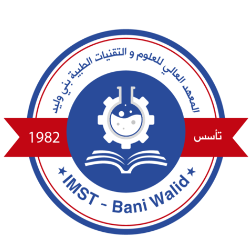
The visual identity of the logo reflects a balance between tradition and modernity, with a strong focus on medical sciences and education. Its various elements work together to convey a sense of trust, knowledge, and progress.
1. Colors:
Dark Blue (Primary color of the inner circle):
-
Meaning: Represents deep knowledge, stability, trust, professionalism, and academic authority.
-
Suggested Color Codes: #003366 (Dark Navy Blue) or #000080 (Navy Blue), giving a sense of seriousness and importance.
White (Used for the inner graphic elements):
-
Meaning: Symbolizes purity, clarity, truth, and new beginnings. In medical and scientific contexts, it reflects precision and cleanliness.
-
Color Code: #FFFFFF (Pure White).
Red (Color of the two ribbons):
-
Meaning: Suggests vitality, importance, energy, and passion. It may also symbolize health or emergency in the medical context.
-
Suggested Color Codes: #CC0000 (Bright Red) or #FF0000 (Pure Red), adding visual impact and appeal.
Medium Blue (Outer frame color):
-
Meaning: Bridges the dark blue and white, providing a smoother visual transition. It may also represent communication and openness.
-
Suggested Color Codes: #3366CC (Medium Blue) or #4682B4 (Steel Blue).
Gray (Background color – not a core identity color but influences perception):
-
Meaning: A neutral tone that allows other colors to stand out. It conveys professionalism and formality.
-
Color Code: Depends on the specific shade used.
2. Typography:
Traditional Arabic Font (Top of the logo):
-
Meaning: Reflects authenticity, heritage, and cultural identity connected to Bani Walid and Libya.
-
Font Example: Could be a Kufic or clear Naskh style.
Modern Latin Font (IMST – Bani Walid):
-
Meaning: Denotes modernity, global outreach, and ease of communication with an international audience.
-
Font Example: Clean and simple sans-serif fonts like Arial or Open Sans.
Font for “Established” and the year “1982”:
-
Meaning: A simple, clear font focusing directly on the historical information.
-
Font Example: A straightforward sans-serif or serif font.
3. Graphic Elements and Details:
-
Open Book: A clean and simple design emphasizing the concept of education and foundational knowledge of the institution.
-
Conical Flask inside a Gear:
-
Flask: Represents laboratory sciences, chemistry, and scientific research—core to medical and technical fields.
-
Gear: Symbolizes technology, progress, and engineering—highlighting the technical aspect of medical sciences.
-
Combined: Reflects the integration of theory and practice in medical technical education.
-
-
Circular Shape: Conveys unity, inclusiveness, and continuity.
-
Two Red Ribbons: Strategically placed to highlight the establishment year and the Arabic name of the institution, adding visual dynamics and structured division.
-
Star: May represent excellence, guidance, or another symbolic meaning specific to the institution.
4. Composition and Balance:
-
The symmetrical arrangement of elements within the circle reflects order and professionalism.
-
The balanced use of colors ensures visual appeal and prevents distraction.

Address
City Center, next to Bani Walid General HospitalAl-Mardum Road, Bani Walid, Libya
Contact Information
Phone: +218 XX XXX XXXX
Email: info@imst.edu.ly
Follow us on social media
Number of visitors

